|
Coming of Age to a Teen Near You
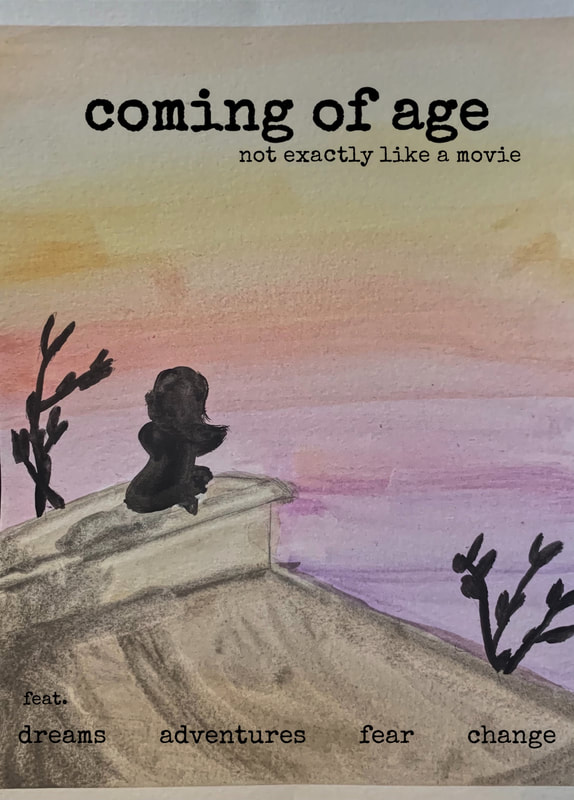
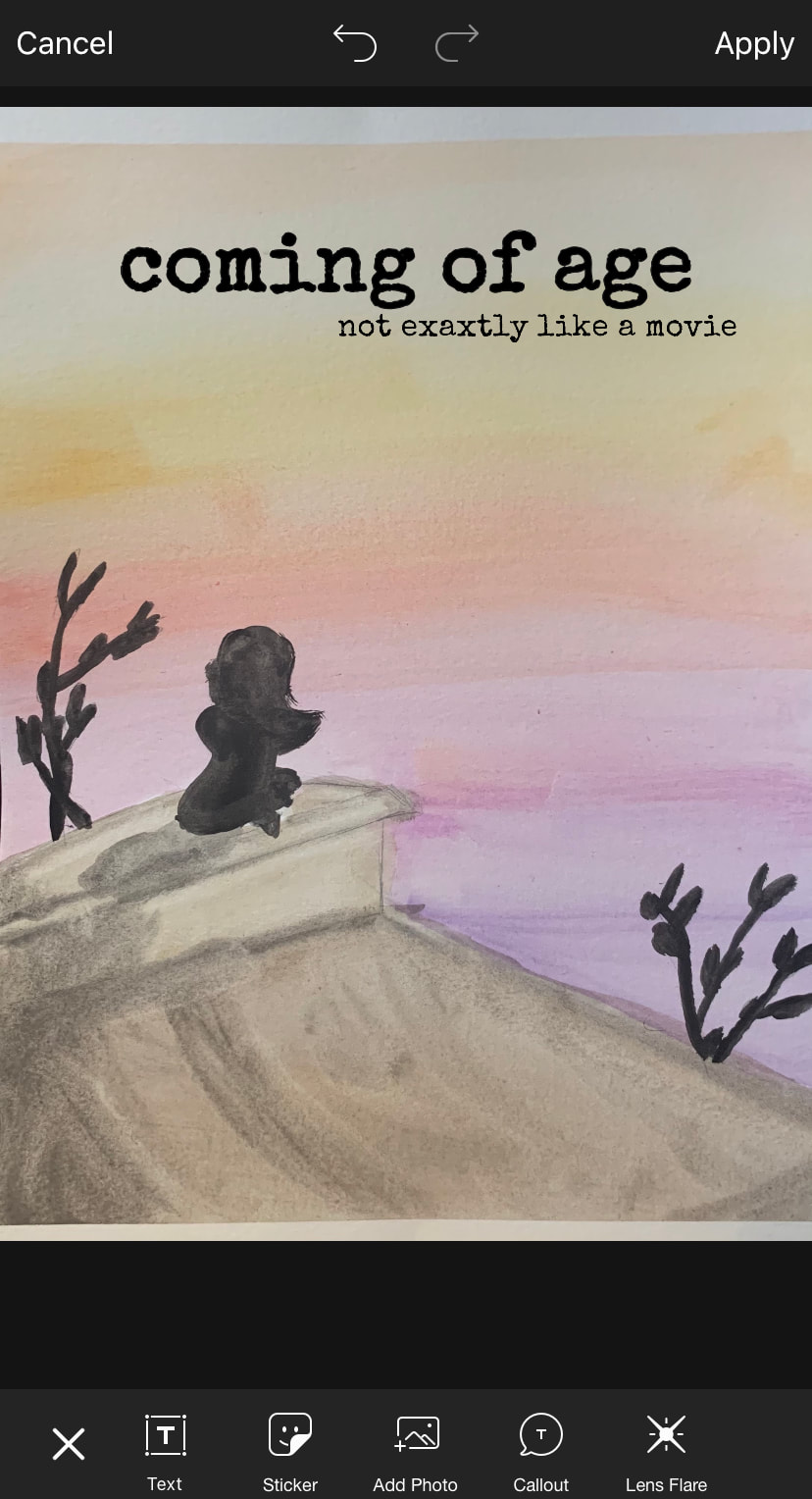
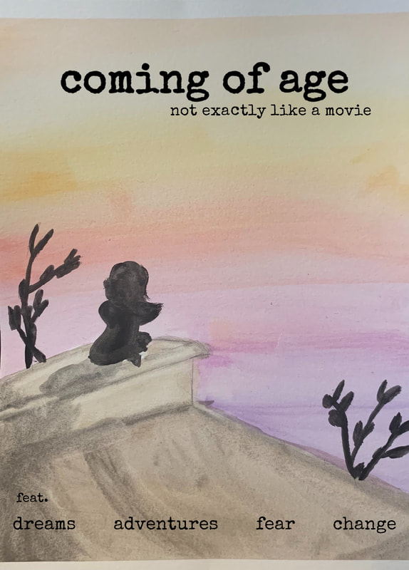
Watercolor on paper, digital editing 91 cm x 61 cm October 2020 Exhibition Text This mixed media work was inspired by modern movie posters and the work of Claude Monet. It presents the romanticism of being a teen through the use of colors and text. It explores the struggle of young people to except that their lives aren't movie perfect. |
Inspiration
|
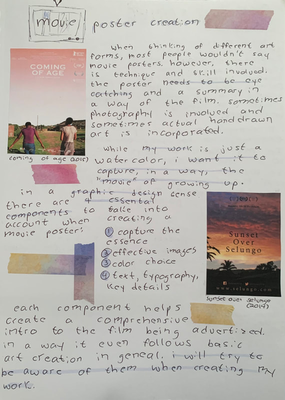
When I came up with the idea for the project I knew I wanted it to be mainly inspired by movie posters. I originally planned for it to be lens based, but because of circumstances I changed to watercolor painting. However, while researching poster making I found examples of both photography based and illustrated posters. I learned about four important components that are taken into account when creating movie posters. They are listed out on the page to the left. I plan on incorporating this creative thinking/process into making my work. The posters I chose as main inspirations feature the sky as the main focus and simple subjects in the foreground. I want the sunset to be what catches the viewers eye for my piece. |
|
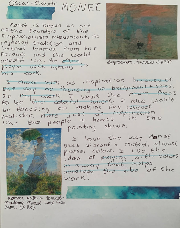
For the coloring and style of the work I chose Monet as an inspiration. I will be playing with lighting and shades of colors for my work to help develop the mood of the painting. I will also be using a very loose, impressionist style because I enjoy feeling a bit free with the drawing and painting of art. It allows me to be more comfortable and confident in what I am creating. |
|
Planning
|
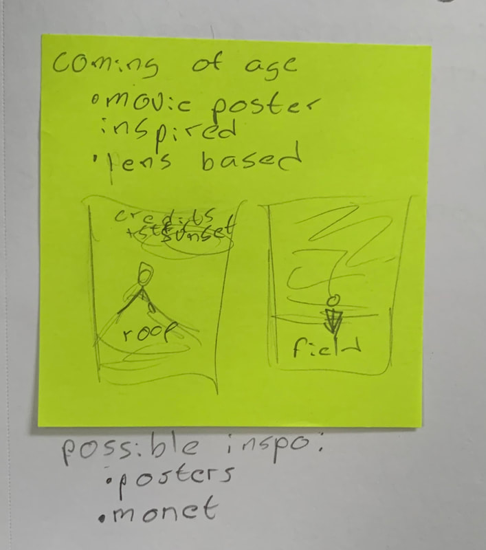
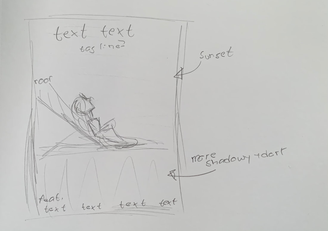
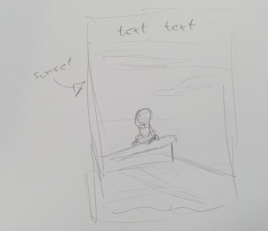
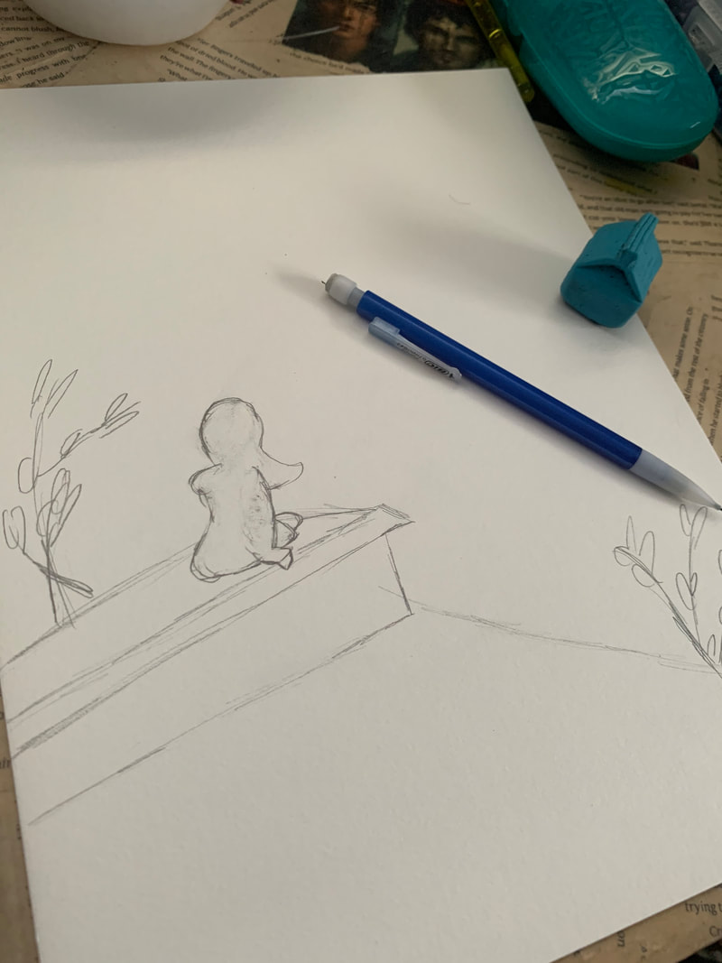
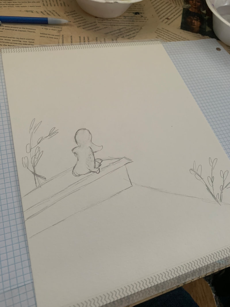
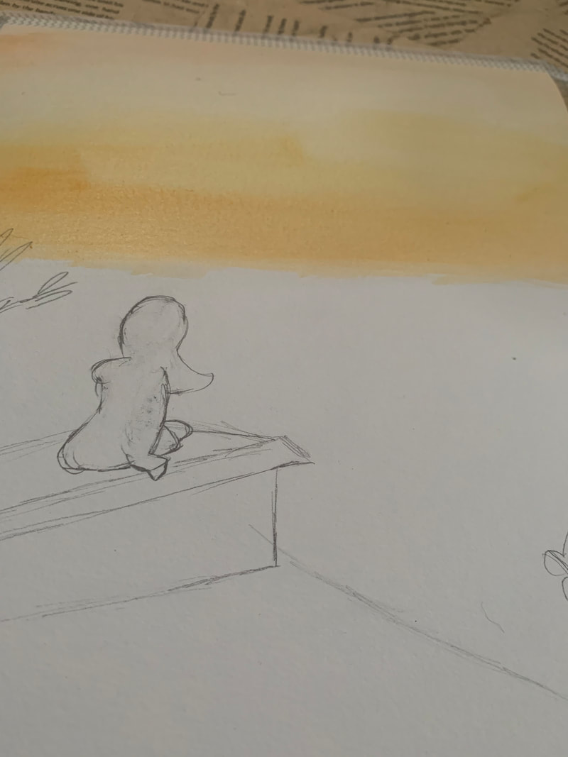
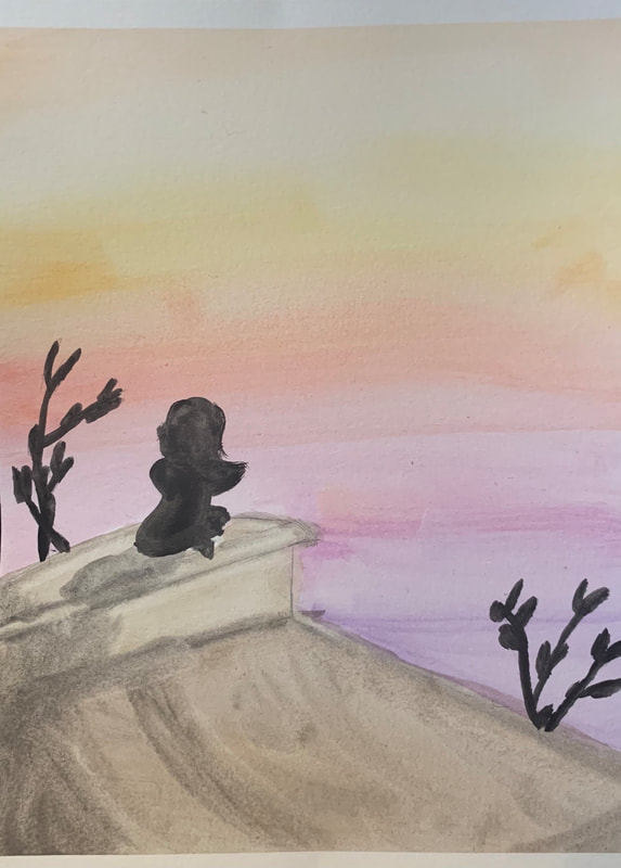
I've had the idea for this project for a long time. I originally wanted it to be lens based featuring myself and the garage in my backyard. However, I focused on other projects first and it got too cold to do what I wanted. I also didn't really have the time to set it up. So I decided to revisit a favorite medium of mine instead: watercolors. I will most likely add the text in an online editor to make it look cleaner. The sketches below are the first basic idea and then the final version. I wanted the feature a subject sitting on top of a roof facing away towards a sunset. At first I wasn't sure what perspective I wanted, but after searching up some different references I settled on the the sketch on the bottom right. The text will be a play on movie poster titles and taglines, along with "actors" featured. |
|
|
|
Experimentation
|
|
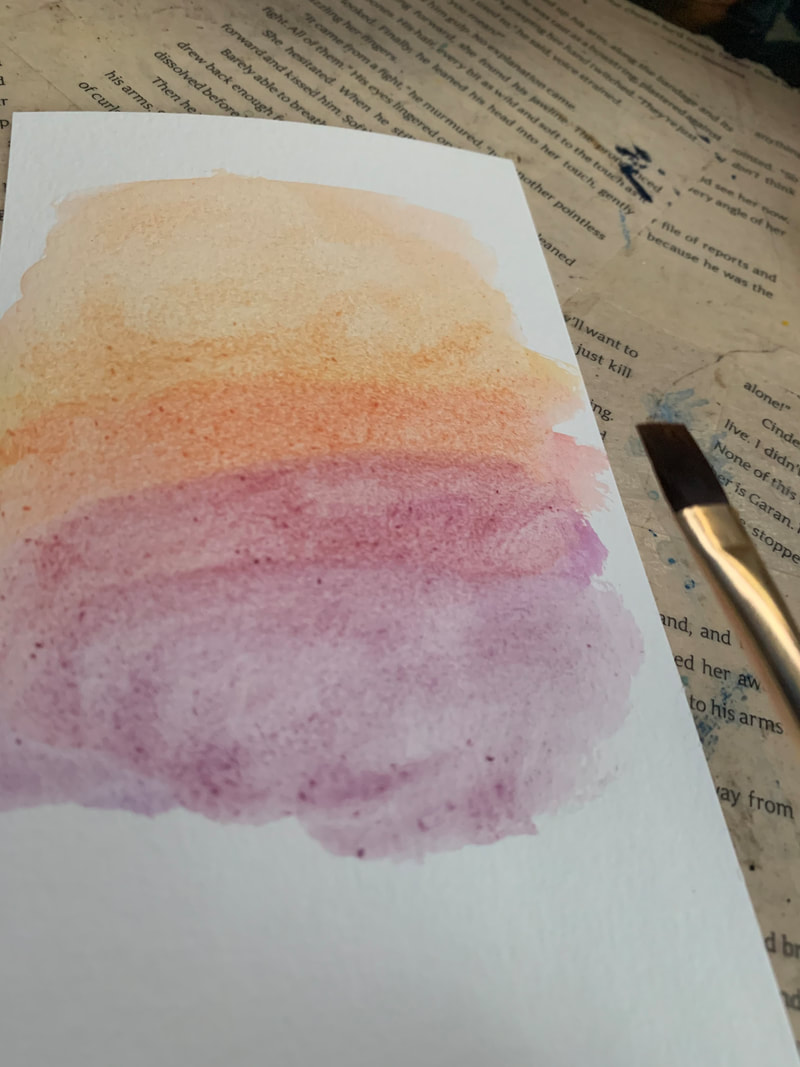
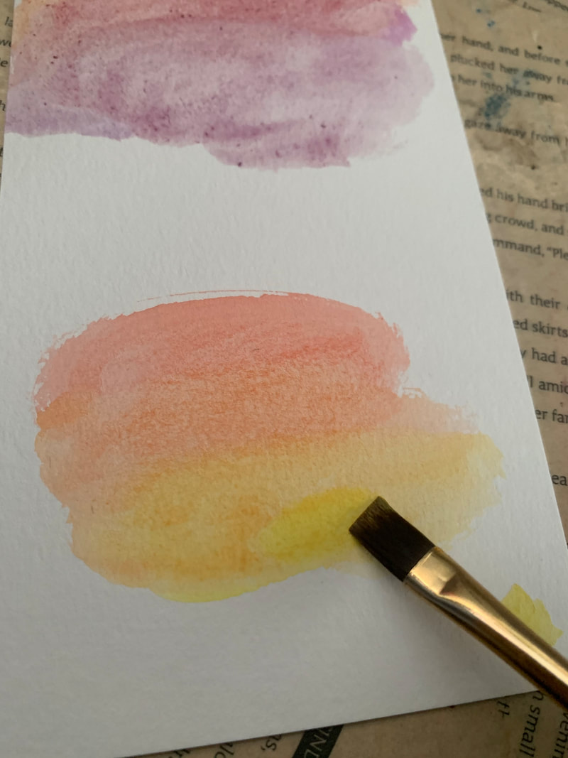
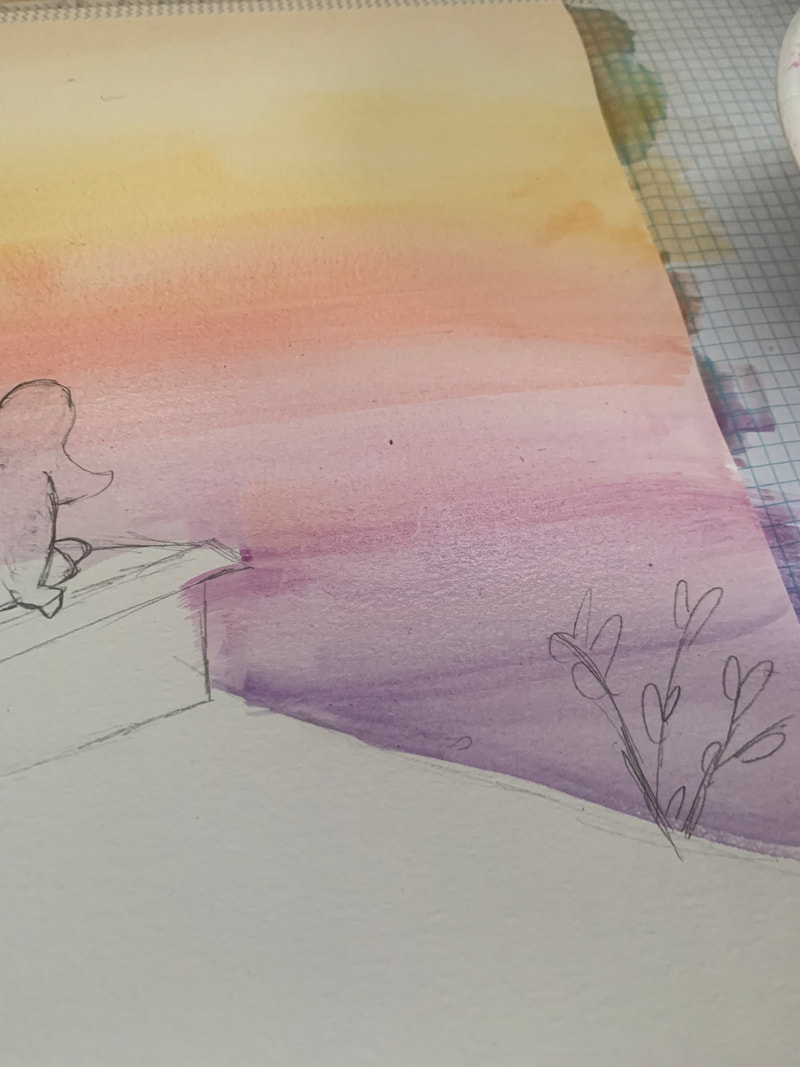
Before getting started on painting I wanted to play around with colors to use on the sunset. I didn't want to just use the basic yellow, orange, and red, so I incorporated purples and creams. I also practiced layering and blending so I would be prepared for the actual piece. |
Process
|
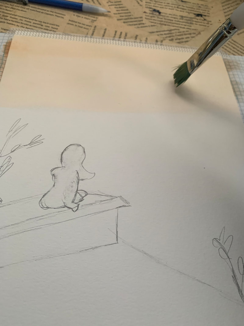
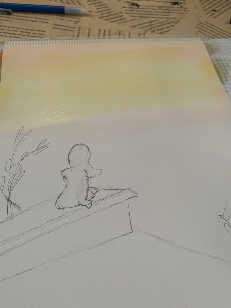
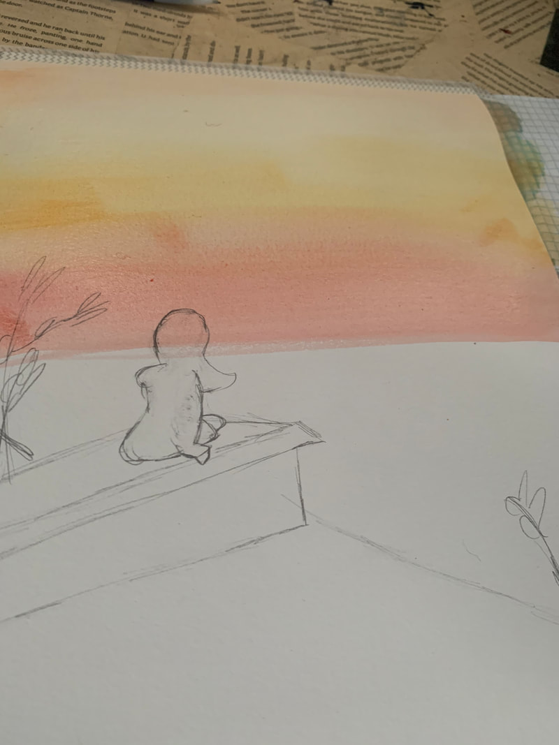
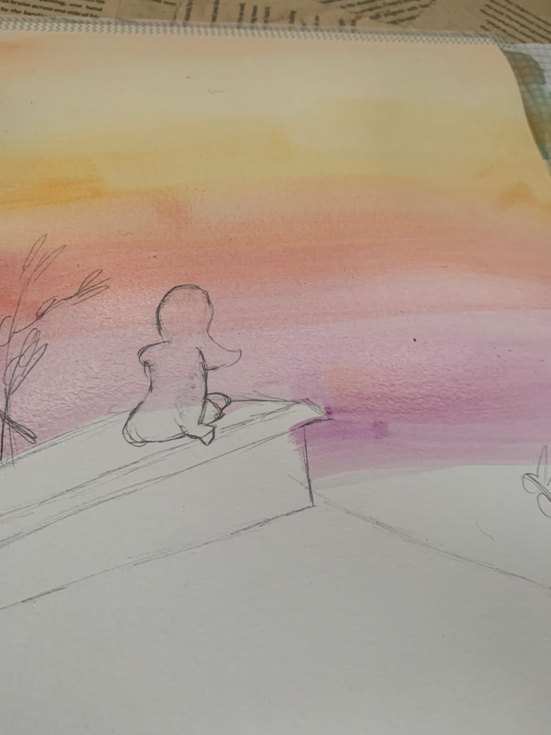
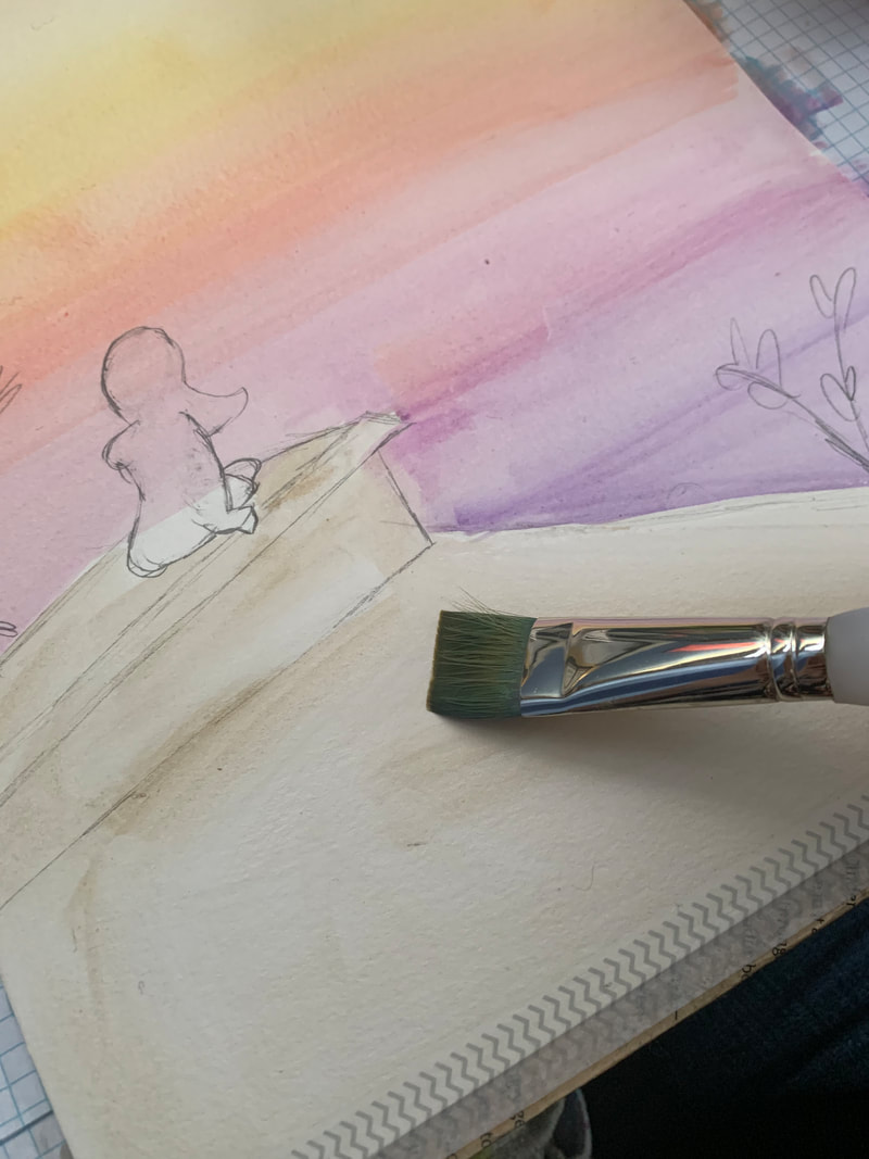
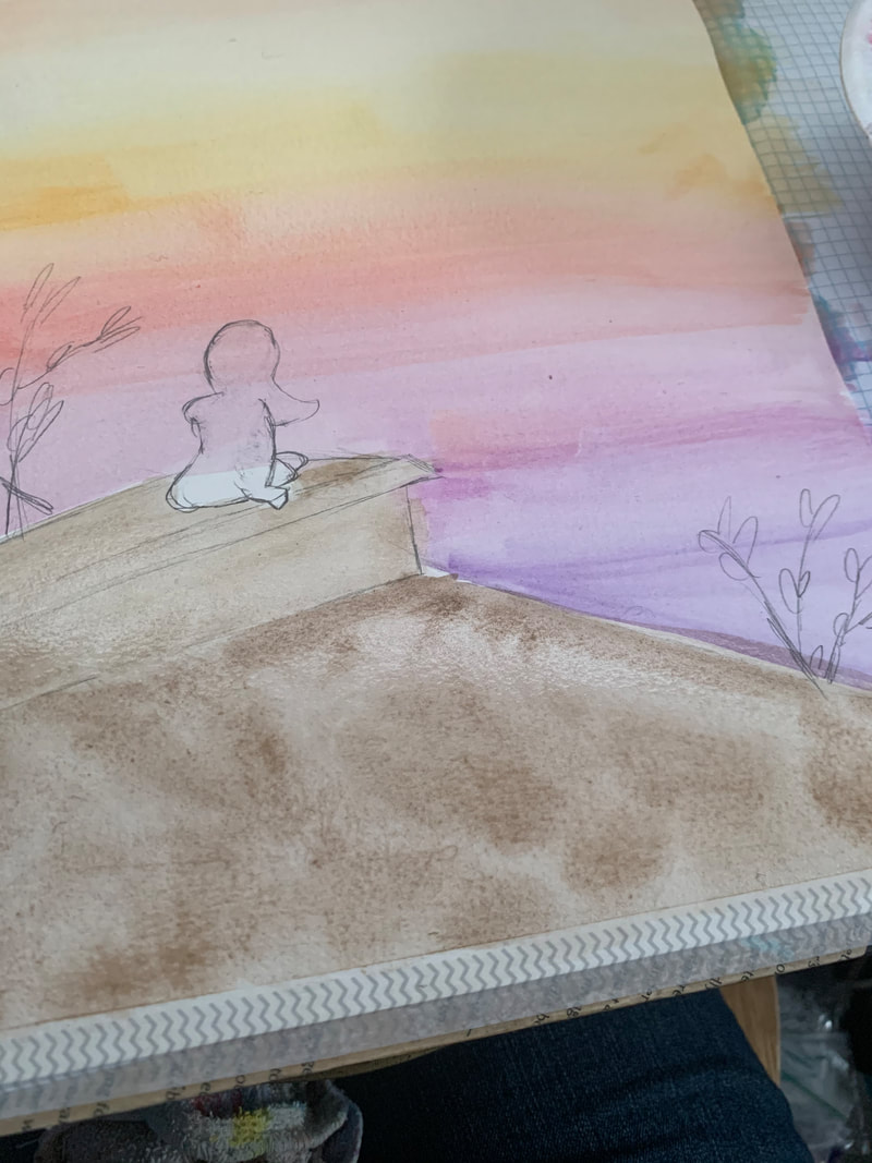
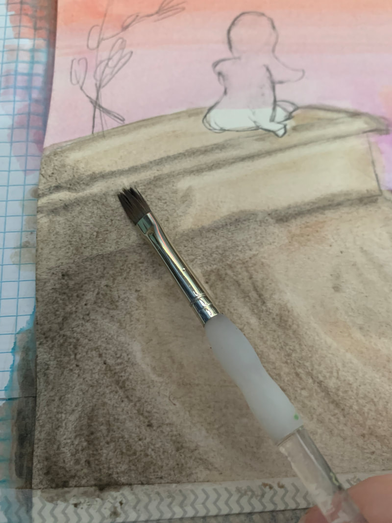
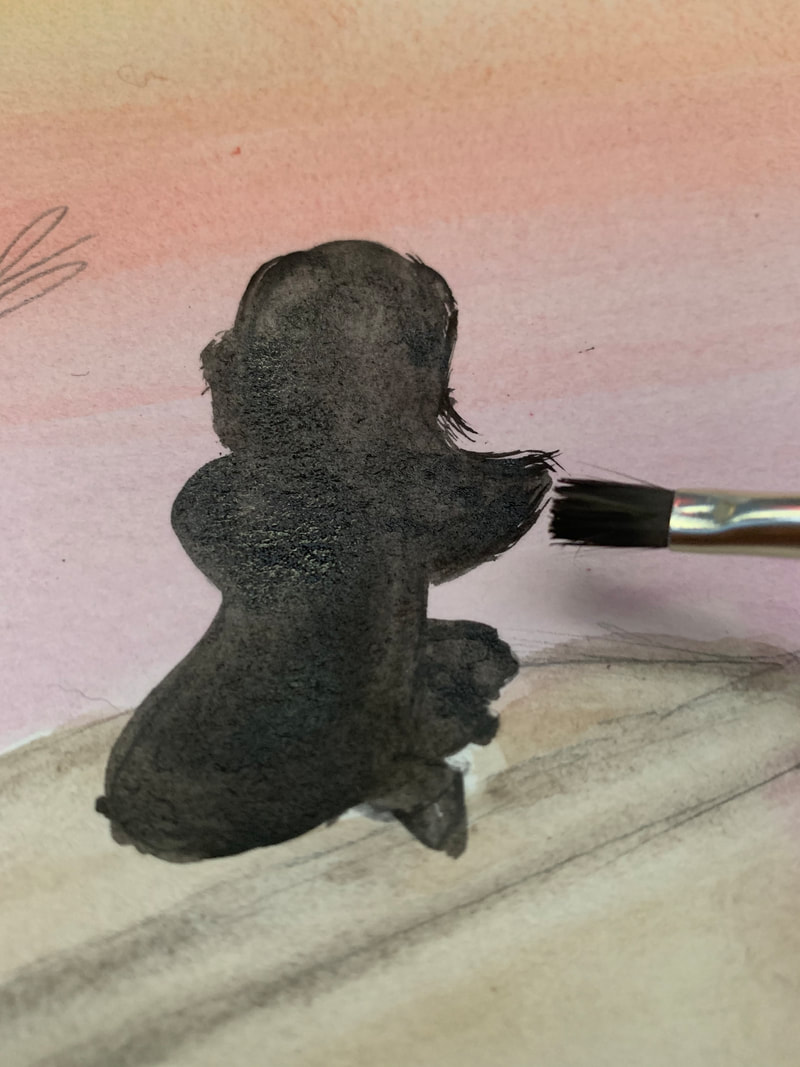
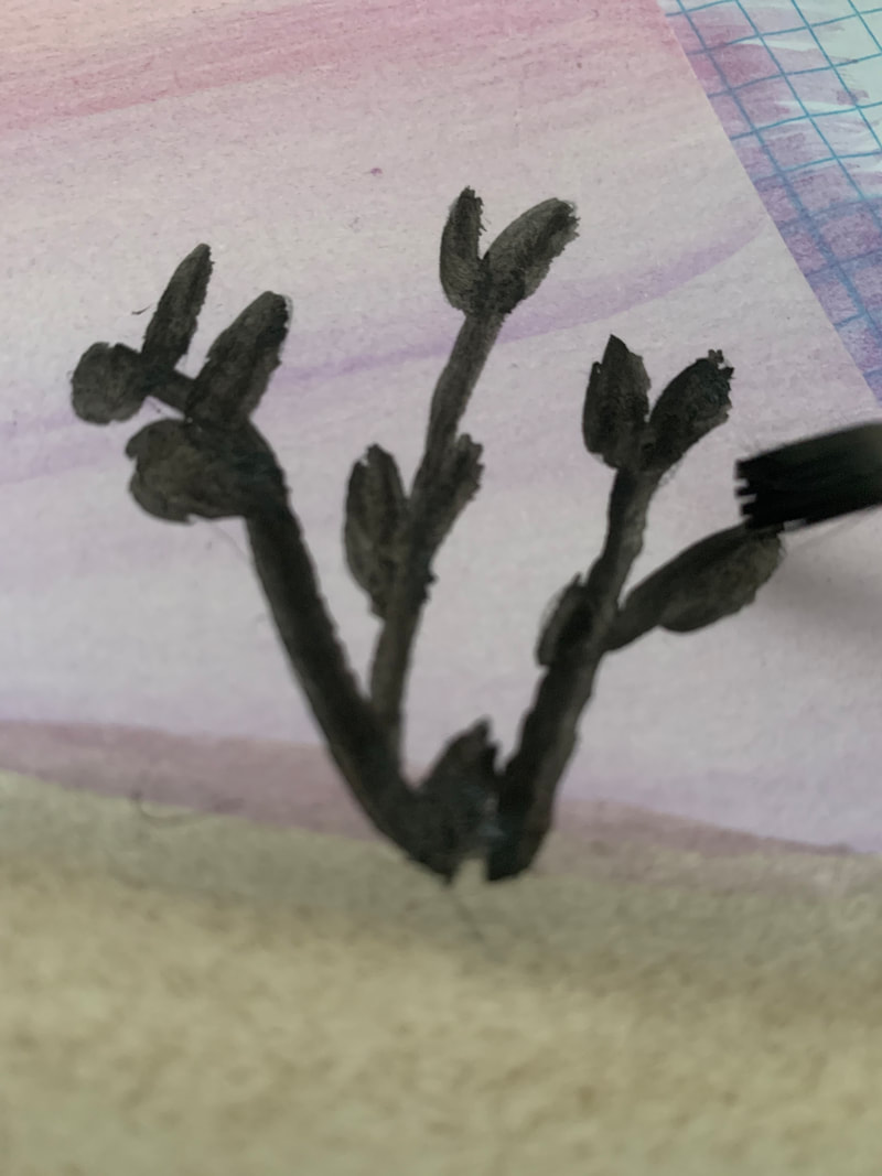
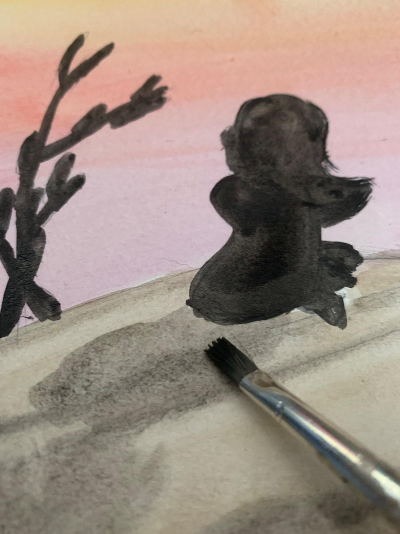
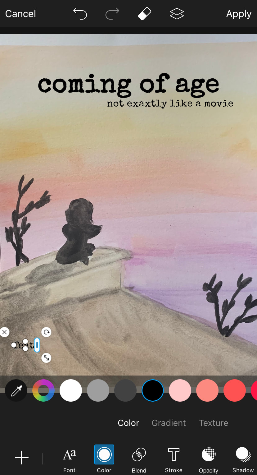
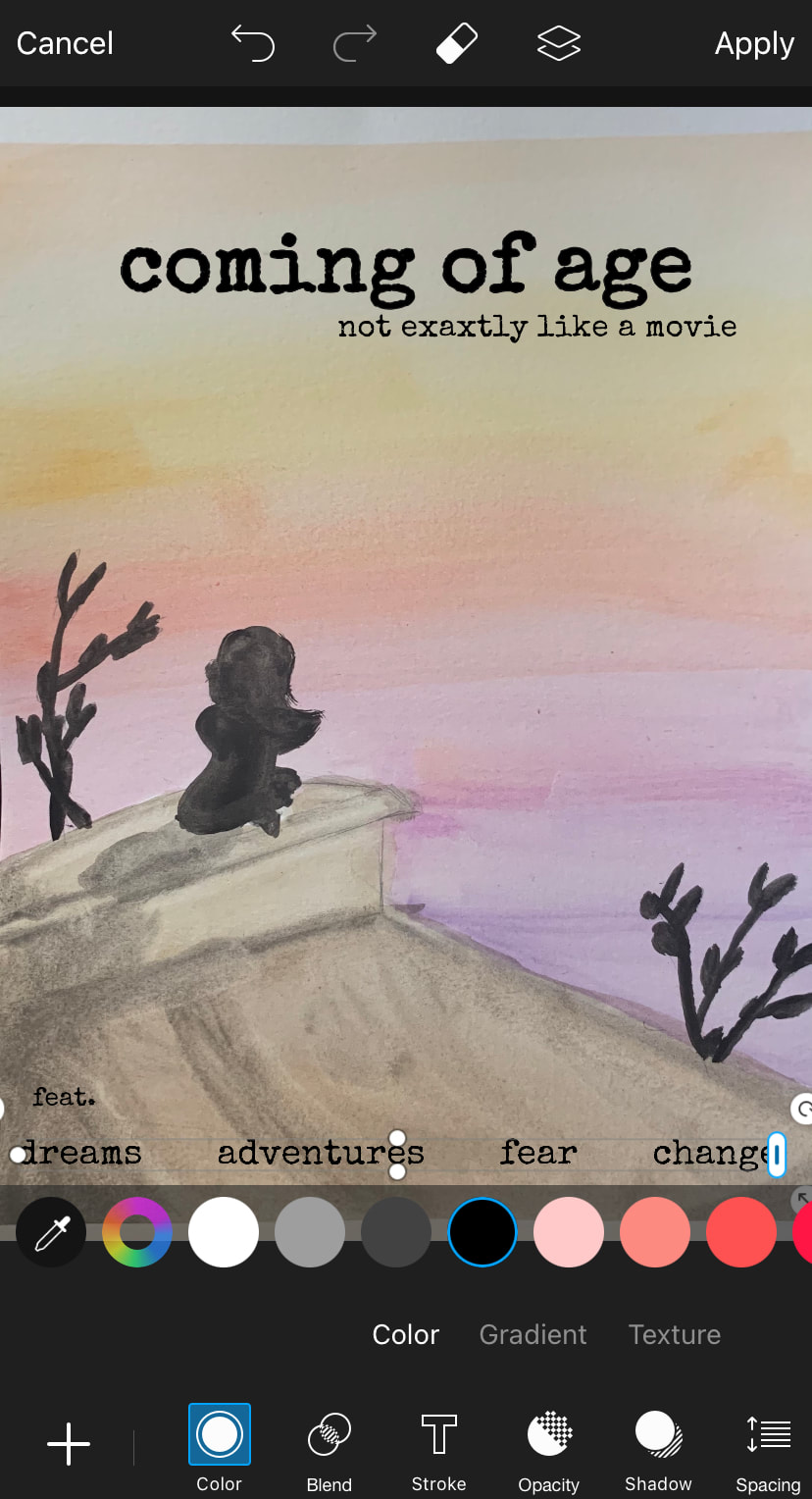
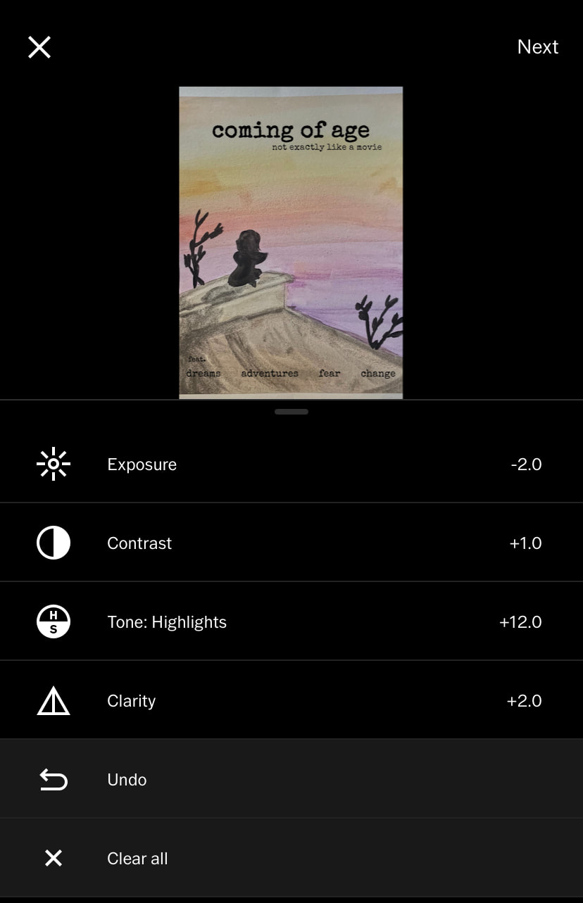
Painting 1. First I sketched out the drawing. 2. Next I placed paper underneath the main page and on the sides. I also taped down the top and bottom to make a half frame when pulled off. 3. I started on the sky by laying down a pale orange. Next I blended in a lighter yellow. 4. After that I added a more golden yellow and blended in a red. 5. Finally, I added a light purple followed by a darker one to make the sunset more interesting. 6. I kept the color opacity light because it gave a soft feeling the the sky. 7. Next I started on the roof by putting down a light gray brown. I darkened it up with regular brown. 8. I used a gray to create shadows and the illusion of lines. 9. After that I used black to fill in the person. I changed to a smaller brush and added flicks to make the hair seem less smooth and flat. 10. Finally I drew in the trees and leaves. I also added a shadow for the person. 11. I waited for the work to dry, then removed the tape. I took a photo to continue working in an editor to add the text. Editing (Adding Text) 1. First I added the title and tagline. I chose a typewriter like text because it feels nostalgic. 2. After that I added the "features" of things that many young adults deal with as they grow up. 3. I realized I accidentally misspelled "exactly", so I went back and fixed that. 4. Finally I did some editing to make to enhance the work and make everything blend together a little better. |
|

Reflection
I am happy with my final product, however I wish I was able to use photography instead. Still I am happy with the way I blended the colors and added shadows. This project is a good affirmation of my improved skills with watercolors. I am happy with my color choices and use of text.
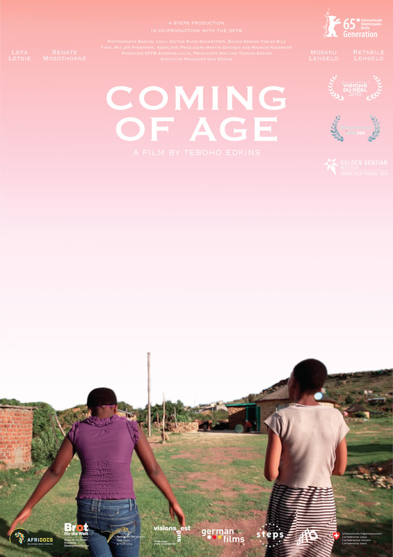
Coming of Age. 2015.
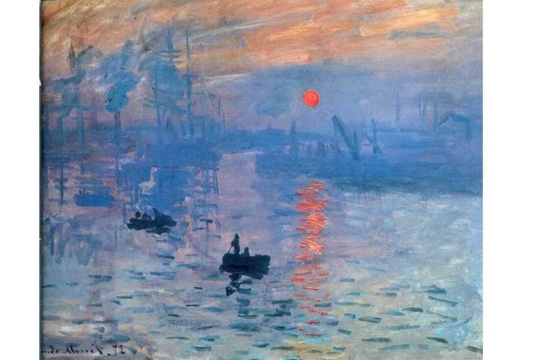
Impression, Sunrise. 1872. Claude Monet.
|
Compare and Contrast
Similarities
Differences
|
|
ACT Questions
Clearly explain how you are able to identify the cause effect relationship between your inspiration and its effect on your artwork.
I really love the way Monet used color in his paintings, so I really tried to think about the way I chose mine. Also, the poster I used as inspiration has a similar composition to my painting.
What is the overall approach the author has regarding the topic of your inspiration?
The author seemed very knowledgeable about movie poster creation. I felt like actually did learn a lot about how to think critically about posters in general.
What kind of generalizations and conclusions have you discovered about people, ideas, culture, ect. while you researched your inspiration?
Most people don't really think of illustrated movie posters, but I think that both realistic and illustrated posters can be good advertisement for the stories you want to tell.
What is the central idea or theme around your inspirational research?
Poster creation and color choice, along with growing up.
What kind of inferences did you make while reading your research?
Impressionism basically means giving the impression of something, allowing me more freedom when painting my work.
Bibliography
“Oscar-Claude Monet.” Claude Oscar Monet - The Complete Works, Claude Monet Gallery, www.claudemonetgallery.org/.
Pereira, Lorenzo. “The Most Famous Claude Monet Paintings Everybody Adores.” Widewalls, 7 June 2016, www.widewalls.ch/magazine/monet-paintings.
Raz, Diana. “Graphic Design: Insights into Creating Movie Posters.” Icons8, 7 Sept. 2020, icons8.com/articles/graphic-design-movie-posters/.
“Woman with a Parasol - Madame Monet and Her Son.” National Gallery of Art, www.nga.gov/collection/art-object-page.61379.html.
